Free Tutorial and Project file: How to Design a medical Book Cover in Photoshop
Free Tutorial and Project
file: How to Design a medical Book Cover in Photoshop
This tutorial will teach you how to design a medical book
cover in Photoshop.
First, we need to create a brand new Photoshop file, the
standard dimensions for a medical book or pamphlet cover will be 17 inches for
"width", and 11 inches for "height", I prefer to set the
"resolution" to 72 so the file size will not be quite big.
For those who prefer to watch the video tutorial they can
watch it directly on YouTube from here
Before you begin your design, you need to show the
"grid" as it will help you divide the cover background easily; to
show the grid, go to "view" menu, click on "show" (submenu)
and then click on "grid".
Now, let's organize our work into groups of layers, but we
need to learn first What Are the Layers Needed in
Our Design??
We will have (5) groups of layer:
1. Backgrounds
2. Header
and Footer
3. Shapes
4. Logo
5. Typing
(1) Backgrounds
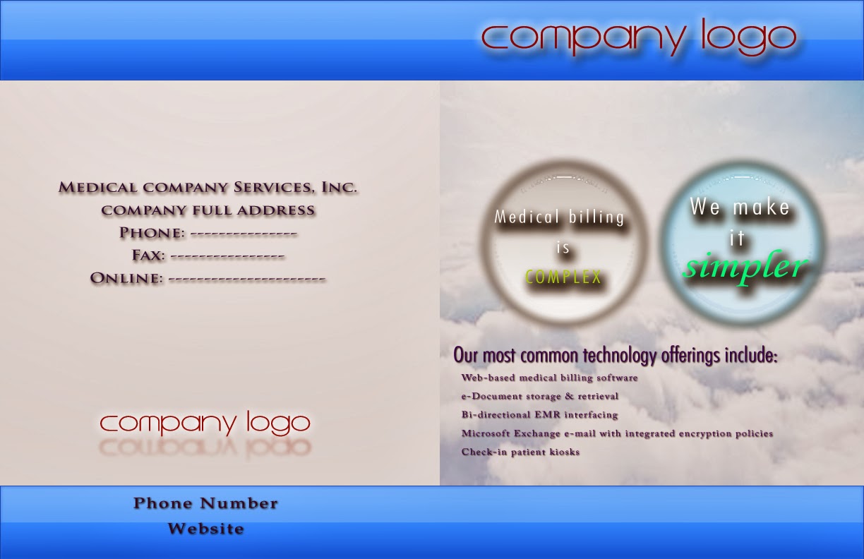
The basic cover background must have a light gradient effect.
It does not need to be vivid or distinguished, here we can use light grays
gradients. We can fill the background on a single layer or divide it into two
separate layers according to printing preferences; in my case I divided it into
two front and back layers (left and right).
As this is a medical cover, we can use a light image on the
front side of the cover, such as sunshine, sky or green land, this layer needs
to be a bit transparent and blurred to keep it low profile.
(2) Header
& Footer
This layer group will contain two identical layers, for both
header and footer; here it is the time to use vivid gradient styles, perhaps
orange or blue gradients (of course not together). Use the rectangle
selection tool to make the header, fill it with gradient, and cerate a copy of
it for the footer. Drag the footer and header to their appropriate positions.
(3) Shape
Layers
It can be used to
highlight the company slogan(s), I used in this file two circles filled with
different gradient styles, the style here will reflect the target behind the
slogan sentence, for instance, it can be a light or vivid gradient if the
sentence refers to better results, such as "Simpler", and vice
versa; for other words such as "Complex" we need to use dull
grays.
(4) LOGO
Logo will appear twice:
·
Big logo will appear on the front upper side of the cover
·
Small logo will appear on the back lower side of the cover
Both layers need to have shadow and glow effects to be
distinguishable from other typing layers.
(5) Typing
Layers
There will be four
separate typing layers:
1. Slogan layers (must be adjusted
to the shape layers)
2. Brief description of
the company services, it needs to be written in a simple font with small
letters
3. Address- Phone- Fax-
Online website; this layer will appear on the back side, written with large letters.
4. Phone number and company
website must be rewritten in a separate layer with bold letters. This layer
will appear on the lower back side of the cover.
Now the tutorial is done, I hope you can design your own
cover after reading my step by step tutorial or by watching the video tutorial.


Comments
Post a Comment